Quiet Luxury Interiors: Neutral Minimalist Home Guide
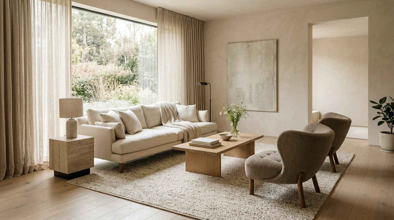
Quiet Luxury Interiors: Minimalist Rooms with a Neutral Palette and Timeless Style
Quiet luxury is the art of making a home feel refined without feeling showy. It relies on calm proportions, honest materials, and a neutral palette that looks better over time—not louder. The goal isn’t an empty room; it’s visual clarity that lets craftsmanship, comfort, and a few excellent choices do the talking.
What “Quiet Luxury” Looks Like at Home
- Understated elegance: fewer focal points, stronger craftsmanship, and intentional negative space.
- A minimalist baseline: visual clarity first; décor becomes meaningful rather than abundant.
- Timeless over trendy: shapes and finishes that won’t feel dated after a season.
- Comfort is part of the aesthetic: softness, acoustics, and lighting make rooms feel expensive.
Minimalism has deep roots in art and design, but in interiors it becomes most livable when it’s paired with warmth, texture, and practical planning. For background on minimalism’s origins, see Britannica’s overview: https://www.britannica.com/art/minimalism.
The Foundation: Layout, Proportion, and Breathing Room
Quiet luxury starts with what you don’t see: clear paths, balanced spacing, and furniture scaled to the room. When circulation is effortless, everything else feels calmer.
- Prioritize clear pathways (generally 30–36 inches in main routes) so the room feels calm and functional.
- Choose fewer, larger pieces instead of many small ones to avoid visual clutter.
- Anchor seating to a rug size that fits the conversation area; front legs of sofas/chairs should typically sit on the rug.
- Use repetition and symmetry lightly (paired lamps, balanced art placement) for quiet order without stiffness.
Room Planning Checkpoints
| Area | Goal | Quick rule of thumb | Common pitfall |
|---|---|---|---|
| Living room | Conversation + calm | Keep main walkway clear; center pieces around a focal point | Too many small accent tables |
| Bedroom | Restful + airy | Leave space on both sides of the bed when possible | Overcrowding with extra storage furniture |
| Dining | Easy movement | Allow comfortable chair pull-back space | Oversized table in a tight room |
| Entry | Simple landing zone | One surface + one mirror + one light source | Open storage that reads as clutter |
Neutral Palette, Done Right
A neutral home isn’t “all beige.” It’s a controlled range of tones that share compatible undertones, then repeated across rooms so the whole home feels continuous.
- Build a palette from undertones: decide if the home leans warm (cream, sand, taupe) or cool (stone, greige, soft gray) before buying anything.
- Use a three-layer approach: base neutral (walls/large upholstery), secondary neutral (rugs/wood), and a deep anchor (charcoal, espresso, blackened bronze).
- Limit high-contrast edges; quiet luxury often uses gentle transitions rather than stark color blocking.
- Treat white as a material choice: different whites can clash if undertones don’t match.
Color is measurable as well as emotional. If you’re curious about how color is defined and communicated, the CIE’s colorimetry standards are a useful reference point: https://cie.co.at/publications/colorimetry-4th-edition.
Materials and Texture: Where the “Luxury” Lives
When the palette is restrained, texture becomes the main source of depth. The easiest way to elevate a minimalist room is to upgrade what you touch most often: textiles, hardware, and lighting.
- Prefer natural or natural-looking materials: linen, wool, cotton, wood, stone, and well-finished metals.
- Mix matte and subtle sheen: matte walls with a softly reflective lamp shade or satin hardware creates depth without busyness.
- Introduce texture in larger fields (rug, drapery, bedding) rather than many small knickknacks.
- Aim for consistency in quality: one obviously low-quality item can break the elevated feel.
For bathrooms, a single “hero” material can do a lot of heavy lifting—like a stone-look countertop paired with simple hardware. A cohesive, timeless option is the 42″ Grey Bathroom Vanity with Carrara Quartz Countertop, which naturally supports a neutral scheme without needing extra decoration.
Lighting That Feels Soft, Not Flat
Lighting is one of the fastest ways to shift a room from merely minimal to genuinely luxurious. The aim is softness and dimension—never glare, never harsh shadows.
- Layer lighting: ambient (overall), task (reading/cooking), and accent (art/shelves).
- Use warm, comfortable color temperature (often 2700K–3000K) for living spaces and bedrooms.
- Add dimmers wherever possible to shift from functional to relaxing at night.
- Choose sculptural-but-simple fixtures; quiet luxury favors form and proportion over ornate detail.
For a quick technical primer on color temperature (CCT) and what those numbers mean in real rooms, the U.S. Department of Energy offers a clear overview: https://www.energy.gov/energysaver/led-lighting.
If the room needs one statement that still reads quiet, consider a single sculptural floor light with clean lines, like the Nordic Lava Led Floor Lamp. Placed near a sofa or reading chair, it can replace multiple smaller lamps and reduce visual noise.
Finishing Touches: Minimal Styling with Intent
A Room-by-Room Interior Design Checklist
A Practical eBook Guide for Pulling It All Together
For a streamlined process, Guide to Quiet Luxury Interiors | Minimalist Home Design eBook | Neutral Palette, Timeless Style & Interior Design Checklist compiles the palette logic, layout cues, and a usable checklist that’s easy to revisit while shopping or refining each room.
FAQ
What is quiet luxury interior design?
Quiet luxury interior design is an understated, high-quality approach that prioritizes proportion, craftsmanship, and calm, neutral palettes over flashy décor. It feels elevated because everything looks intentional, comfortable, and well-made.
How do you choose a neutral palette that doesn’t feel boring?
Start by choosing warm or cool undertones, then layer a base neutral, a secondary neutral, and a deeper anchor shade for contrast. Add depth through texture—linen, wool, wood, stone—and a mix of matte and subtle sheen.
What are the easiest upgrades to make a home feel more timeless?
Improve lighting with layers and dimmers, upgrade textiles like drapery and bedding, and reduce surface clutter. Classic hardware/fixtures and one or two well-proportioned foundational pieces also make the biggest long-term difference.












Leave a comment